Ask any online shop owner what’s the one thing they fear the most? And they will tell you – it’s cart abandonment!
And it can’t get any more frustrating than this…your customers liked a product on your website, added it to cart, and then abandoned it.
According to a recent study, the average rate of cart abandonment is 70%!
So, what drives so many customers to get cold feet and give up their purchase at the last moment?
Well, multiple surveys point to one major factor – Poor Design!
Your products may be impressive and you might have more traffic than a New York street on a Monday. But if your checkout process is complicated or appears frustrating to the customer, you are cooked.
Carts will get abandoned!
Thus, a well-designed checkout process is one of the most critical factors in determining the success of your e-commerce store.
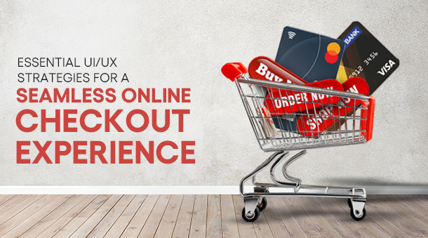
This is why in this blog, we shall explore some critical UI/UX strategies that will keep your checkouts flowing and your customers happy!
Why can a checkout page ruin a good shopping experience?
The checkout page is the ultimate destination for the sales funnel – the conversion. Customers here have already decided on what products they are going to buy and their prices.
Now all they have to do is complete their order – opt for a shipping method, enter their shipping address, apply any applicable discount and finally, pay.
However, this checkout stage is also a place most online merchants fear. Because of the chance that the customer might abandon their cart and leave.
And there might be multiple reasons for this, including:
- Poor shopping cart UI
- Absence of guest checkout options
- Lengthy checkout processes
- Hidden extra costs
- Too many data entries
- Payment insecurities
And a lot more.
The primary reason for cart abandonment is a sloppy UX design. Complicated and lengthy forms and even unclear CTA buttons can turn away customers.
Another primary reason is hidden costs. Your customers have already made up their mind about the price they are going to pay. Now, when they see a hidden cost or an additional charge on the checkout page, they feel like being cheated, and thus, abandon their carts.
Thus, you need a good shopping checkout experience. Something, that fosters trust in customers, and makes them feel good about the money they are going to spend.
And we are here to provide you with tips to make just the One. So, read on while we discuss the optimal checkout page UX!
Why do you need a good checkout page UI/UX?
There is a thin line between the actual conversion happening on your website and the checkout page. It’s the checkout page’s design. And while online business owners pay little to no attention to their checkout page, they run the risk of losing their warm customers.
According to research, around 74% of shoppers switch brands if they find the checkout process complicated. They will just buy from another brand whose checkout page is simple and accessible.
Below is a summary of some compelling reasons why you should have a good UX design for your checkout page.
1. Provides a simple checkout processs
If your checkout process is well-designed, it can simplify the purchasing process for your customers. By following the best practices for a checkout page UX, you can create a seamless checkout experience for your customers and reduce cart abandonment.
2. Increase conversion rates
If you have a user-friendly checkout page, you can improve your conversion rates. When you make it easy for your customers to complete a purchase, you automatically increase the chances of them completing transactions and becoming your paid customers.
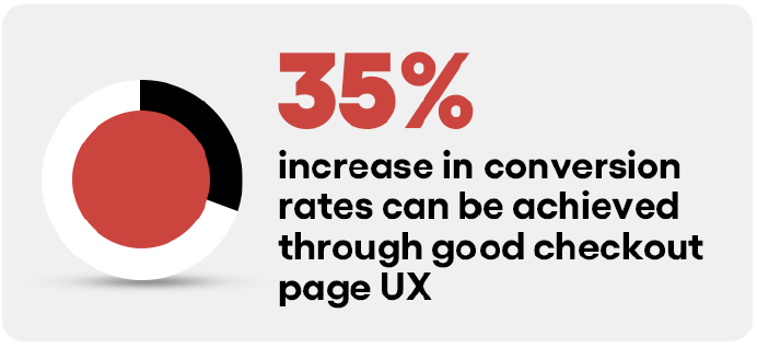
Source: Baymard
3. Improve customer satisfaction
If your customers have a pleasant checkout experience on your site, it can affect them positively. They will be more likely to refer you to their friends and family, or come back to you for future purchases.
The Ideal eCommerce Checkout Process
Now you have a fair idea of why a good UX is necessary for your checkout page. Moving on, let’s look at some essential practices for a checkout page design that will reduce cart abandonment and boost those sweet ol’ conversions!
So, ready to get the “Thank You for your Purchase” page popping once again? Let’s dive in.
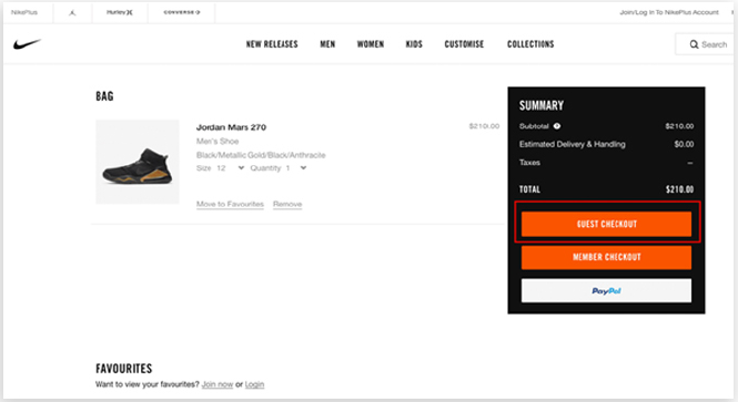
1. Include an option for Guest Checkout
According to data, around 65% of websites don’t have an option for “guest checkout.”
And this can go seriously wrong.
You might not have a quest checkout option for your customers in order to collect user sign-up data. But, forcing your customer to create an account is a bad idea. And a turn-off for them.
Many users don’t want to create accounts simply due to having to remember a password, or for privacy reasons. And as a site owner, you should respect that
Offer your customers the option to allow customers to make a purchase without creating an account. If they wish to save their information for future orders, provide them with the option to create an account after completing the checkout process. This kind of flexibility encourages them to complete their purchases and not abandon their carts halfway.
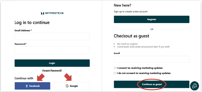
For example, take a look at the checkout option for one of the USA’s most popular nutrition brands, MyProtein. They have included a guest checkout option for customers who don’t want to sign-up and create a new account. The option is in bold and is clearly visible to the customer.
What MyProtein also does right is that they have included an option to checkout with social media handles like Facebook or even Google. Customers can just click on the desired button and get logged in using their Facebook account or Google account instead of having to sign up from scratch.
2. Simplify the checkout process
No one likes to fill out never-ending lengthy forms when they are checking out. Thus, one of the most important aspects of a smooth checkout experience is simplicity. If your checkout process involves multiple steps, unnecessary form fields, or even confusing navigation, customers will quickly lose interest and abandon their cart.
Thus, to ensure you have a simple checkout process, try to consider the following steps.
• Minimize form fields
Only ask for essential information from the customer. For example, if you don’t require the customer’s phone number, avoid asking for it. A streamlined form reduces friction and makes customers feel more comfortable.
• One-page Checkout
If it’s feasible for you, try to combine all the steps of the checkout process, like customer details, shipping info and payment options on a single page. This minimizes the total number of pages and the clicks required to complete the process of checking out.
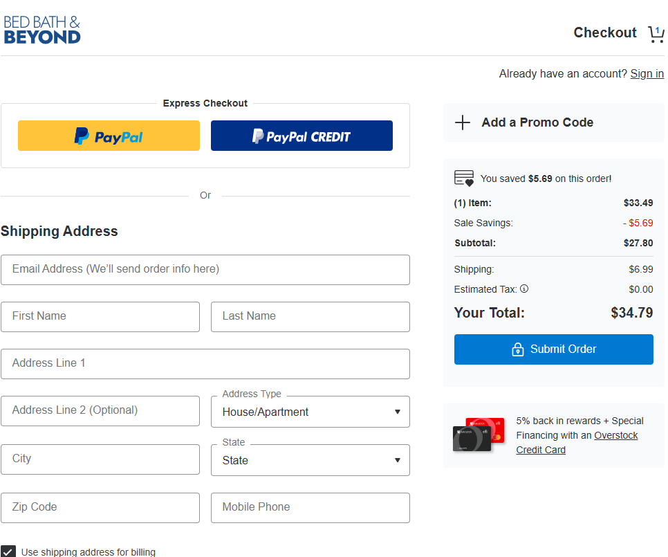
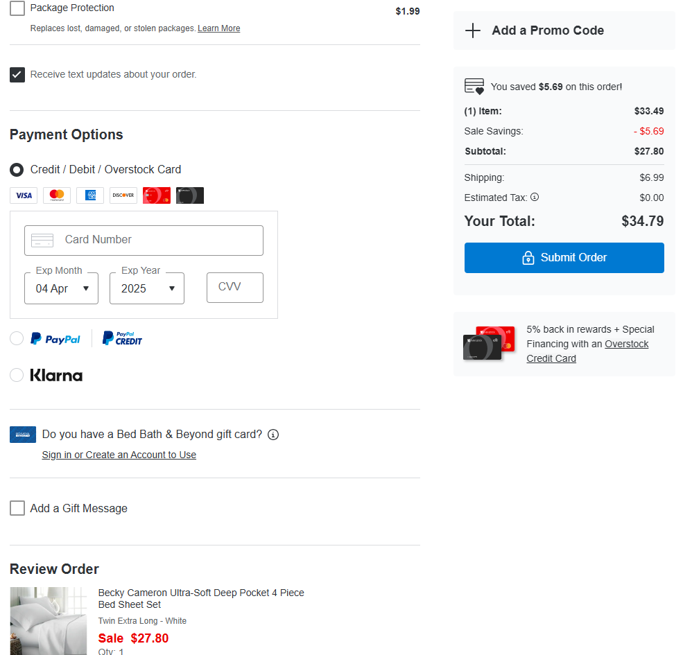
For example, look at the checkout page design of Bed, Bath & Beyond. They have included every step of the checkout process onto a single page, making it easy for the customer to finally pay and submit their order.
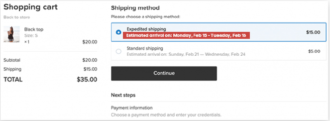
• Progress indicator
If you really cannot avoid a multi-step checkout process, then try to have a progress indicator at the top of the page to show customers where they are in the process. This gives them a clear understanding of what’s left and how long it will take to complete.
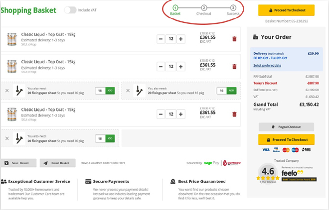
For example, have a look at the checkout page design above. Customers have a clear indication of where exactly they are in the checkout process, and how long it will take them to place the order.
3. Provide Multiple Payment Options
If you want to cater to a wide range of customers, then you have to provide multiple payment options. Not every customer would want to check out using the same payment option. Thus, it’s important to offer a variety of choices.
Some of the popular payment options include:
- Credit and Debit Cards: Make sure you offer the ability to pay using major card providers like Visa, Mastercard, and American Express.
- Digital Wallets: Popular digital wallets like PayPal, Apple Pay, Google Pay, and Stripe are increasingly becoming the preferred method of payment. These options streamline the payment process and increase conversion rates.
- Buy Now, Pay Later (BNPL): These services allow customers to pay in installments, which makes making larger purchases more manageable.
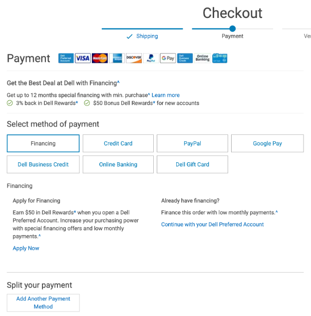
A perfect example of a brand providing multiple checkout options is Dell. Customers have a wide array of payment options and methods to choose from here.
4. Avoid hidden costs
One of the top reasons customers abandon their shopping carts is unexpected costs. Hidden fees, high shipping costs, or surprise taxes can create distrust and lead customers to back out of their purchase.
After all, no one likes extra costs popping up when people already have an idea of the amount they will be paying.
Thus, to avoid this, be upfront about all costs associated with the purchase. Try to display the following clearly during the checkout process:
- Product Prices: Show the price of each item before the checkout page.
- Shipping Fees: Include an estimate of the shipping cost, or better yet, offer free shipping if possible.
- Taxes: Calculate taxes based on the customer’s location and display them in real-time.
- Discounts or Coupons: If a customer is eligible for any discounts, make sure to display them clearly.
The checkout page of Nike clearly shows the total amount the customer has to pay. And this transparency in pricing not only builds trust with customers but also reduces the likelihood of abandonment caused by surprise charges.
5. Implement Trust Signals
Customers purchase from an online business because of trust. They trust the company and the product, and also with their money.
Customers are more likely to complete their transaction if they feel that the website is secure and trustworthy. Thus, adding trust signals throughout the checkout process can improve the user experience.
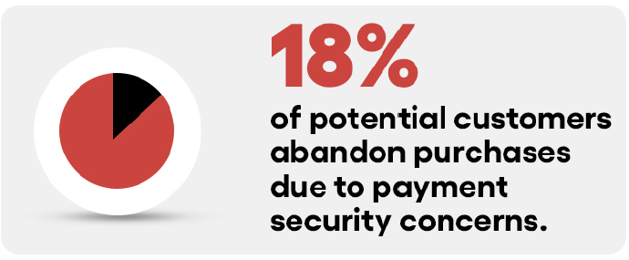
Source: Baymard
Some trust signals that you can include are:
- SSL Certificates: Ensure your website is SSL certified so that customer data is encrypted and secure.
- Security Badges: Display badges from trusted security providers (like McAfee or Norton) to show that your site is safe to use.
- Return Policy: Clearly state your return and refund policy to reassure customers that they can return the item if needed.
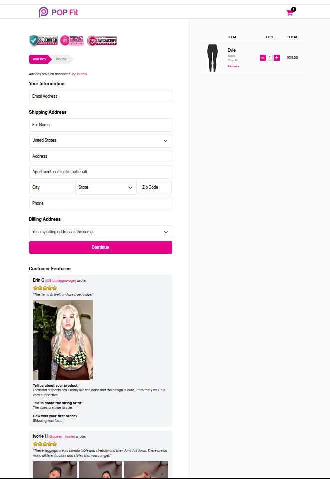
The clothing brand Popfit has a checkout page where they have SSL certificates, privacy guarantees, and even customer testimonials. Thus, displaying these trust signals at key moments during checkout can make their customers feel more comfortable and secure while purchasing.
6. Offer Real-Time Shipping Information
Wouldn’t it be great if you could see your order status in real time? Well, providing shipping information to customers helps them feel more confident about their purchase.
Because knowing a parcel will get delivered in 6-7 days is better than not knowing at all.
Below are some key elements to include.
- Estimated Delivery Date: Display the estimated delivery date based on the customer’s location.
- Shipping Options: Offer multiple shipping options, such as standard, expedited, or same-day delivery, depending on what your business can provide.
- Tracking Information: After a purchase is made, ensure that customers can easily track their order status via a link or tracking number.
The image above shows a checkout page design where customers can clearly see their estimated delivery date. It also shows the shipping options that customers can opt for, along with their net charges.
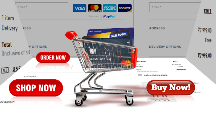
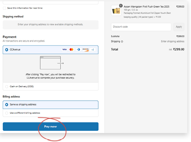
7. Provide a Clear Call-to-Action (CTA)
Imagine you have just added your favourite pair of sneakers, something you have been eyeing for a long time, to cart. You made up your mind about the pocket crunch, and can’t wait to get your hands on that beauty.
You fill up the shipping details, review your information and shipping charges, and want to pay asap. But, you can’t find the “Pay” button.
Frustrating right?
Well, for other customers too, it’s downright frustrating.
The checkout process should be intuitive, and the “Buy Now” or “Proceed to Payment” button should be highly visible and also easy to find.
The call-to-action (CTA) should stand out on the page and guide the user through the final step of the checkout process.
So, while designing the checkout page, try to consider these tips for your CTA buttons.
- Use Action-Oriented Text: Instead of generic text like “Submit” or “Continue,” use action-oriented phrases like “Complete Your Order” or “Pay Now.”
- Make It Visually Prominent: The CTA button should stand out by using contrasting colours and enough space around it to avoid any confusion.
- Keep It Above the Fold: Try to ensure the CTA button is visible without customers having to scroll too much.
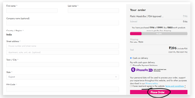
This one’s from our own hall of fame, for our client Jayshree Tea. We designed the checkout page to be simple and intuitive, with clear contrasting CTA buttons.
Another feather in our cap, for our client Varmora Plastech. We designed a cohesive checkout page for them, with CTA buttons above the fold in their brand colours.
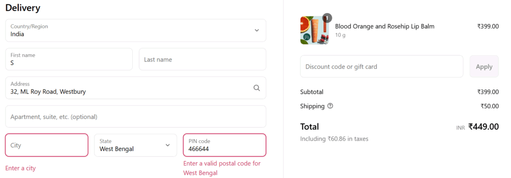
8. Offer Clear Error Messages & Helpful Guidance
Imagine you typing away in a checkout form, and then an error pops up. But, you have no idea what the error is, and no matter how many times you try, the error is still there. Frustrating right?
And for your customers, it is too.
If a form field they have typed in is incorrect, tell them exactly how they should be fixing it.
Below are some ways you should provide context to incorrect form fields.
- Highlight the problematic field in red.
- Provide specific instructions (e.g., “Card number must be 16 digits”).
- Avoid generic errors like “Something went wrong.”
Here’s an example from the skincare brand Juicy Chemistry, and how they have clear and well-defined error messages to guide customers.
9. Use Persuasive Microcopy
Words have the power to stir emotions. Of all kinds. Thus, don’t underestimate the power of a few well-chosen words.
This is where persuasive microcopy comes into play. Those tiny bits of text on buttons, next to form fields or even error messages can nudge users into completing their purchase and also ease their anxiety.
Some examples of effective microcopy are:
- “Free shipping on orders over $50” (Encourages adding more items).
- “Your order is safe with our 256-bit encryption” (Builds trust).
- “Only 2 left in stock!” (Creates urgency).
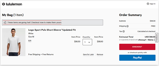
For example, this checkout page for LuLuLemon features microcopy that reads “These items are going fast! Checkout now to make them yours.” This creates a sense of urgency in the customer and compels them to checkout as soon as possible.
10. Provide Easy Access to Customer Support
Customers will want a smooth and easy checkout process. However, questions and concerns may still arise. So, to prevent cart abandonment due to confusion or hesitation, try to ensure that customers can easily access support options.
To enable this, try to consider implementing the following.
- Live Chat: Offer live chat during the checkout process so that customers can get instant answers to their questions.
- Contact Information: Display a phone number or email address for customers who prefer to reach out through traditional methods.
- Help Center: Include links to FAQs or a help center where customers can find answers to common concerns.
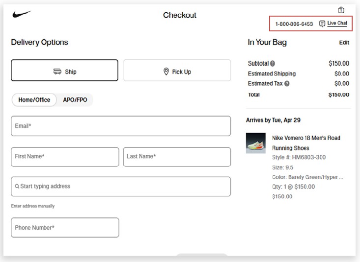
See how Nike has included a support phone number and a live chat feature on their checkout page. This makes it easy for their customers to resolve any issues they may face during checkout.
11. Set up a cart recovery system
If your customer leaves your site without purchasing a single item, it’s not “The End” for you. Or for them either. Because you can always set up your site to detect items they had added to their cart and then recover them on their next visit.
Below are some ways you can gently remind your customers to complete their purchase.
- Email reminders
You can send timely emails to users who abandon their carts. You can include images of the products they left behind with a clear CTA or even a small discount to compel them to complete their purchase.
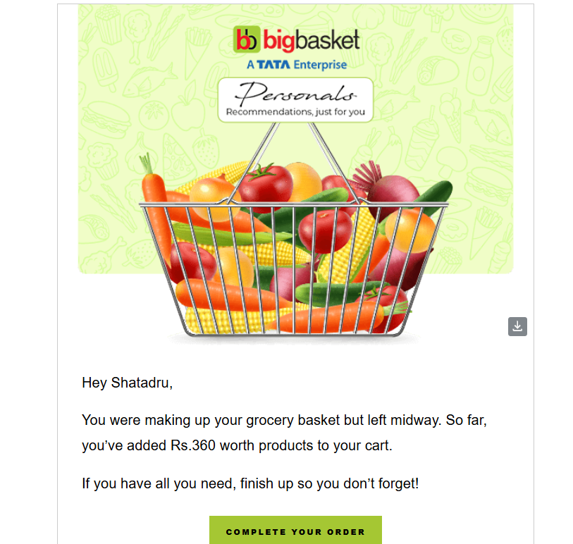
Here’s an example of the Indian quick commerce giant BigBasket, urging a customer to complete their purchase.
- Exit-intent popups
When users are about to leave the site, a well-timed popup with an offer or reminder can grab their attention.

Here’s an example of the smartwatch company Smartwatch for Less, urging users to enter their email id and name for a discount.
- Retargeting Ads
You can also use retargeting to show them the exact products they left behind as they browse other sites. It’s like a subtle “Hey, you forgot something!”
So, with the right kind of cart recovery systems in place, you can always turn “maybe later” into “checked out and happy!”
12. Test and Optimize
One of the best ways to ensure your online checkout process is seamless is to test and optimize it.
A/B testing, user feedback, and analytics are some great tools for identifying pain points and areas that you can improve in your checkout page.
Below, are some of the ways to optimize the checkout process.
- A/B Testing: Experiment with different layouts, CTAs, payment options, and form fields to determine which version leads to higher conversion rates.
- Heatmaps: You can also use heatmap tools like Microsoft Clarity to see where customers are clicking and which parts of your checkout page they’re ignoring.
- Analytics: Track cart abandonment rates and identify at which point customers are leaving the process.
Thus, regular testing and optimization can help you create a more efficient and intuitive checkout experience for your customers.
Checking out…
Needless to reiterate any further, you NEED to create a seamless checkout experience for your customers to reduce cart abandonment and increase conversions.
And remember, keep your checkout process as simple as possible and try to avoid any unnecessary distractions. Oh, and we didn’t mention mobile friendliness in the points above, because hey, it’s 2025 and if your site isn’t mobile friendly, you might as well be accepting payments through carrier pigeons.
So, here’s to creating a smoother and more enjoyable shopping experience for your customers.
Let’s get those orders rolling!
But wait, if you are unable to create a great checkout page all by yourself, we are here to help.
At Nico Digital, we don’t just design checkout pages—we craft seamless, conversion-driven experiences that your customers actually enjoy. From intuitive layouts to persuasive microcopy and lightning-fast mobile optimization, we make sure every click brings you closer to a sale.
Let’s talk checkout that checks all the right boxes.
Reach out to Nico Digital today—where smart design meets serious results.